Background

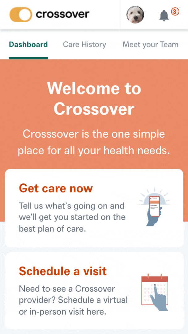
Crossover Health's mission is to offer an entirely new care delivery model for health activist employers. I was brought on as a Senior Product Designer to help research, design and prototype the MVP for the company’s digital health care platform.
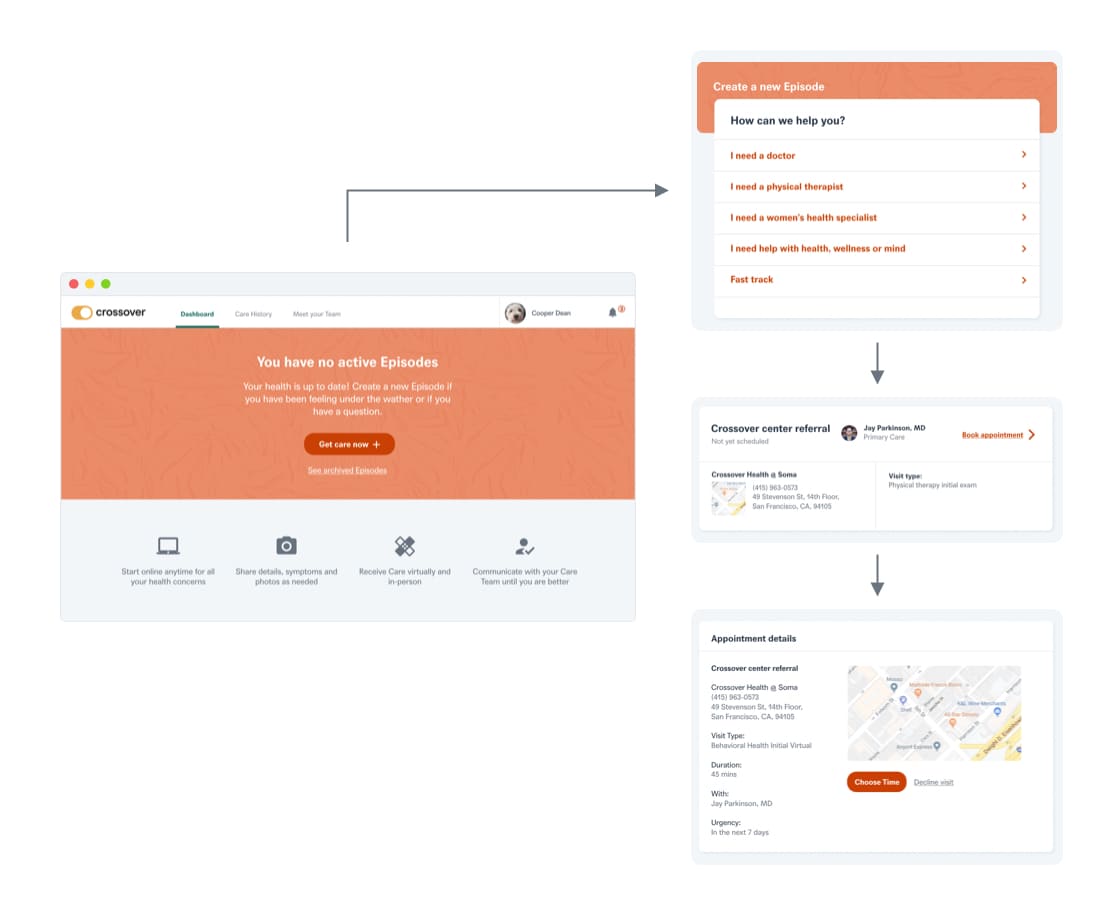
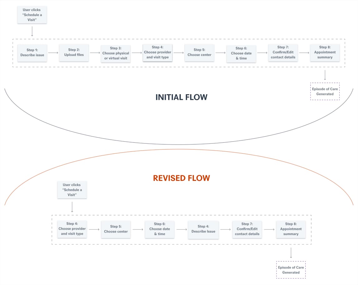
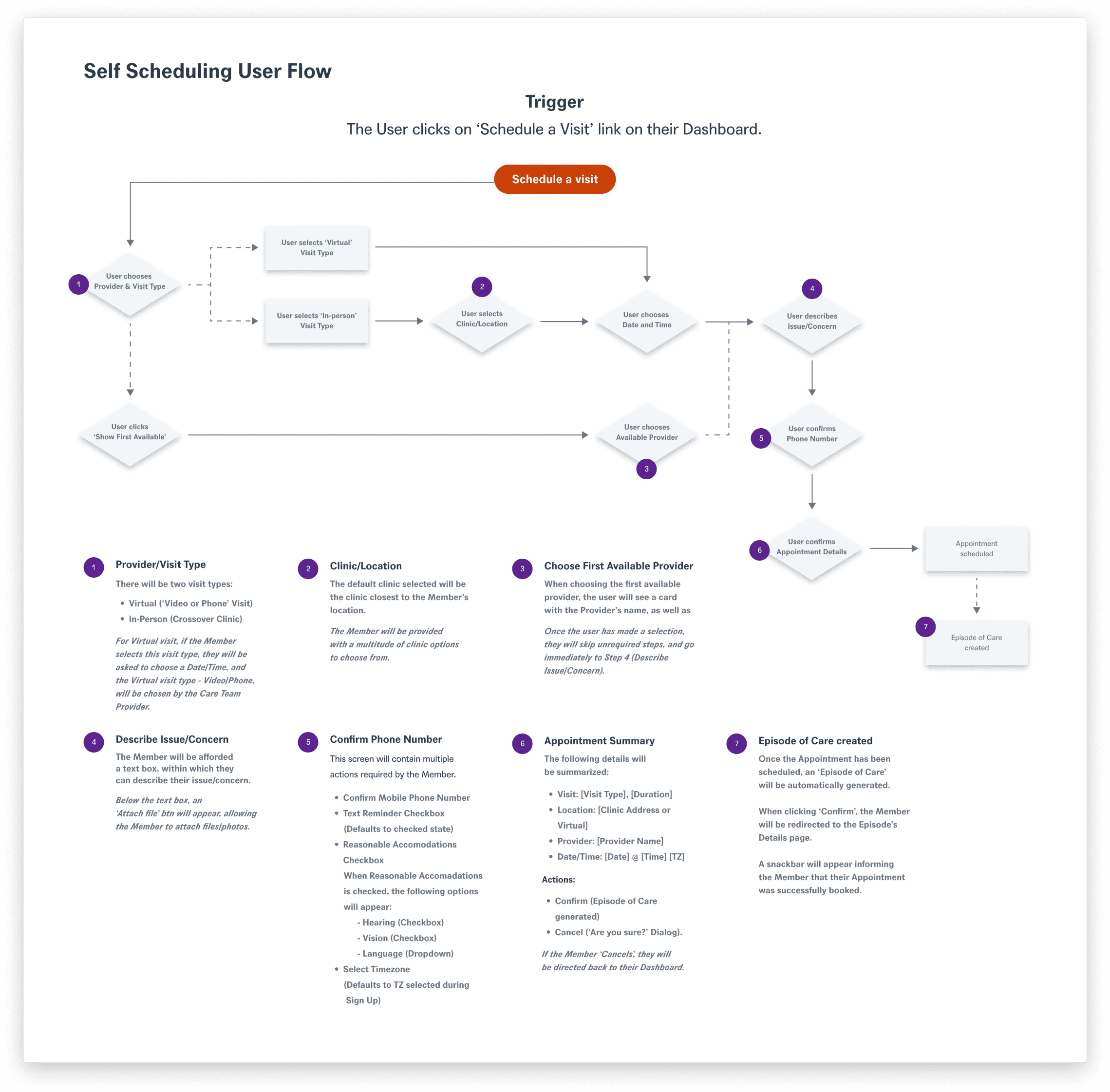
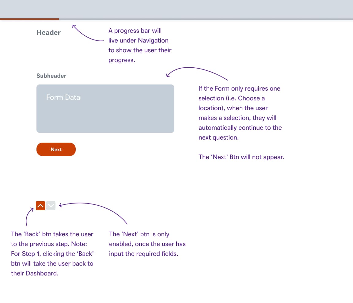
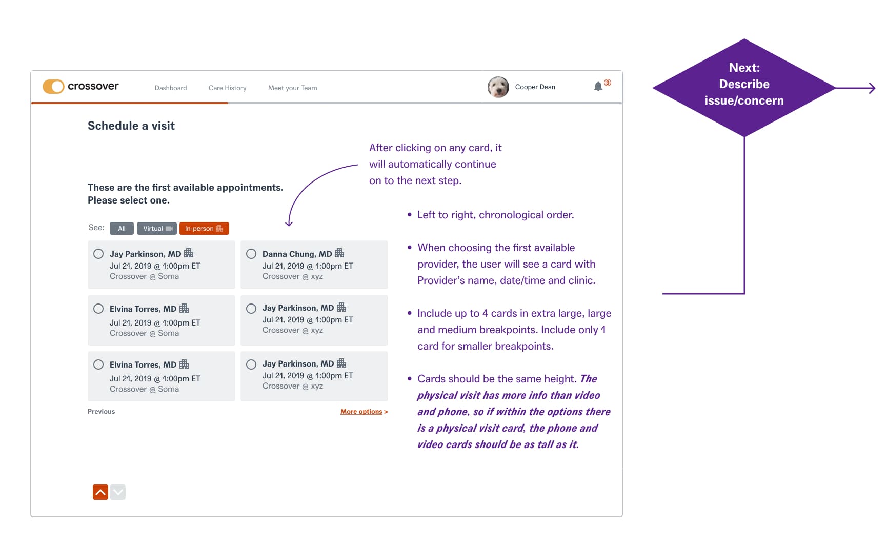
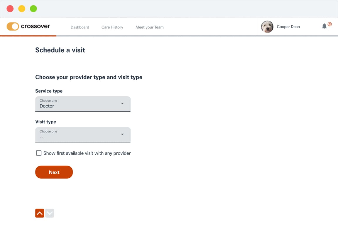
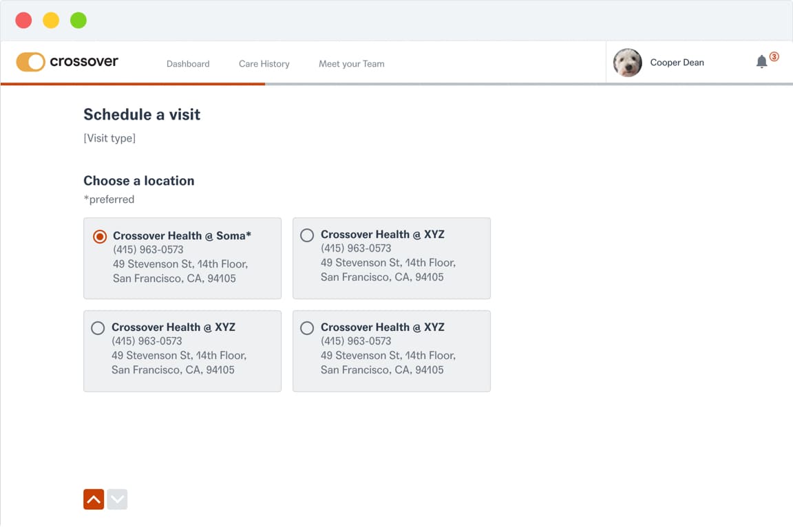
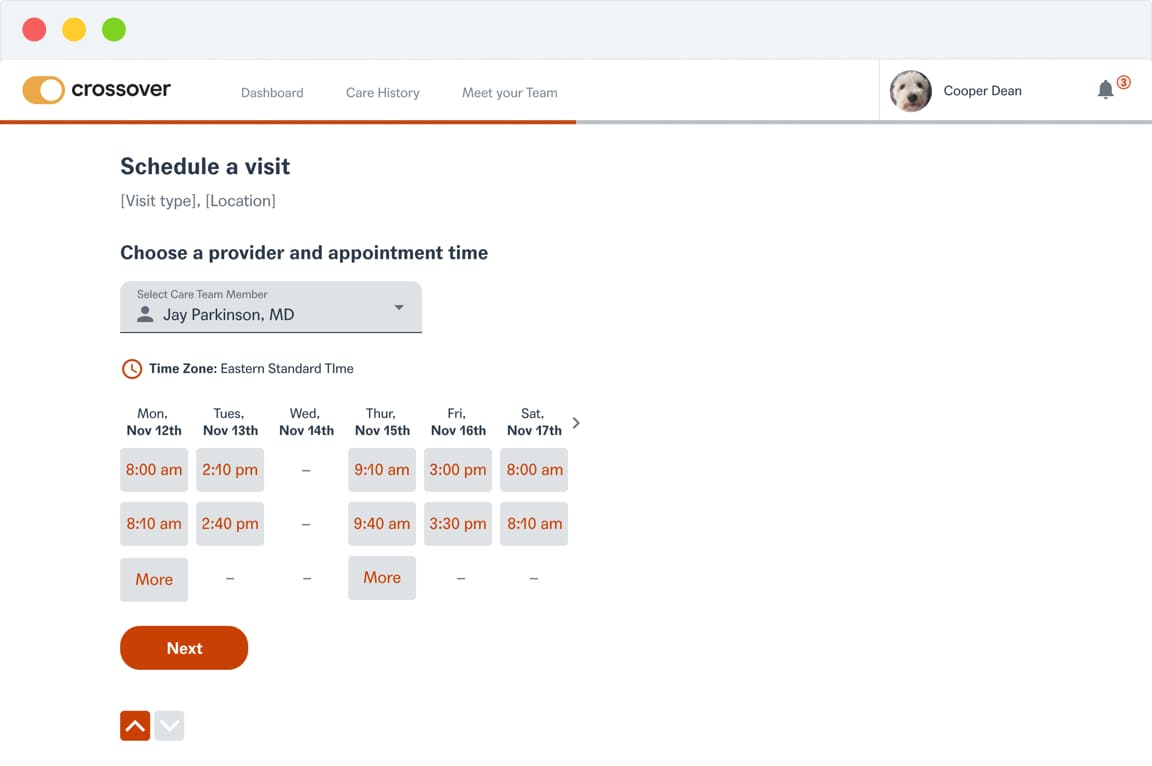
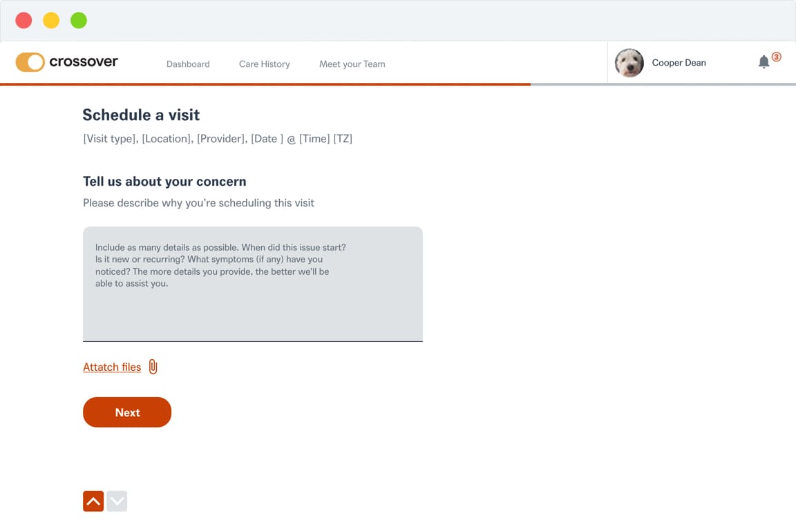
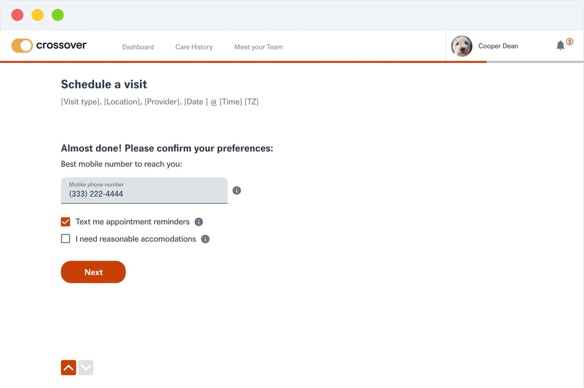
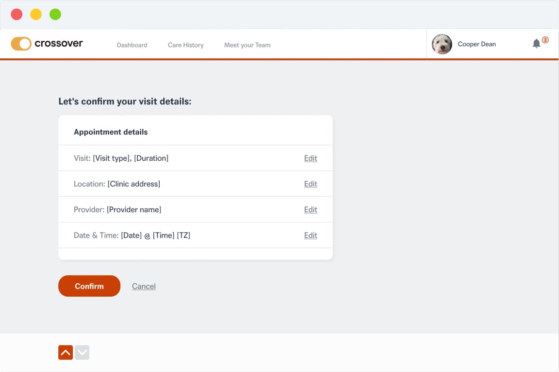
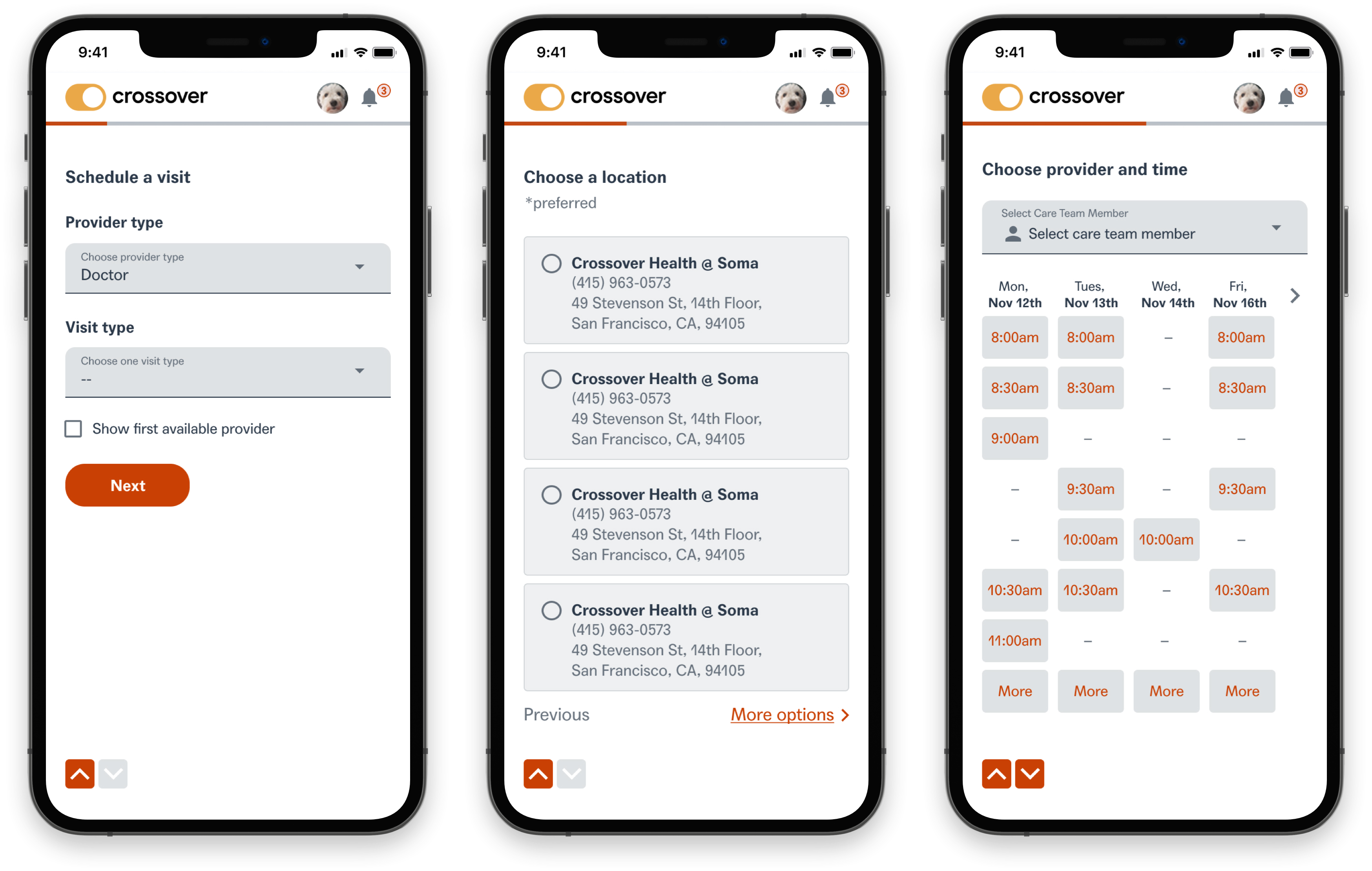
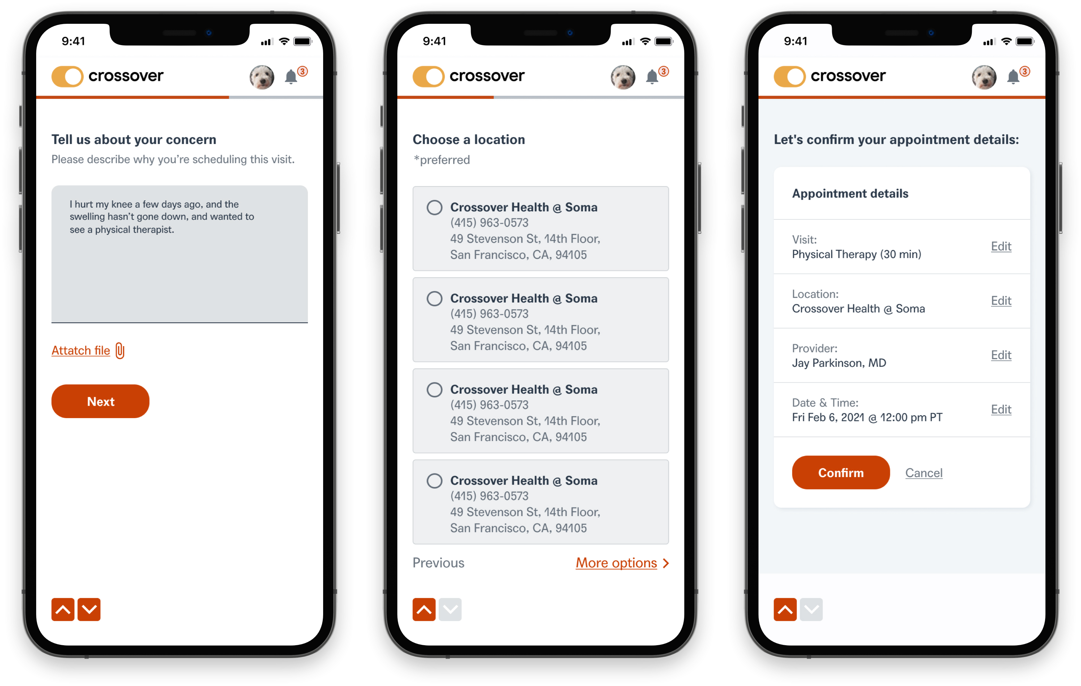
Project context

The self scheduling feature was added post-MVP. Through user research, we determined that the ability for a user to book a visit without having to create an Episode of Care was a requested and much needed feature on our platform. I worked alongside another designer to discover, define and design the feature, including: Creating user flows, designing screens, creating prototypes, and usability testing.

Team & role

Role

Product Designer

Team

Jay (Lead), Cata and Myself (Design), Nicole & Julie (PMs)

Tools & Methods

Figma, Asana, Jira, Bugherd, Productboard, Ideation, Research, Wireframing, UI mockups, Interactive prototyping, Usability testing, QA testing

Duration

2.5 yrs

Identifying the problem

Understanding the problem

We identified that the member currently only had two ways to schedule a visit: Calling a clinic to schedule, or through creating an Episode of Care, and requesting a referral.

Understanding the users

I interviewed 4 users to find out how they feel about the appointment scheduling/referral process when creating an Episode of Care. In interviews, I asked them to recall and walk me through their experiences when trying to schedule a visit at a clinic. The users main pain-point was the inability to schedule a visit on their own via our platform.

Developing the solution

Our goal was to provide the user with an alternative way to schedule a visit. We decided to add a feature within the platform that would allow the user to bypass creating an Episode of Care, and self schedule a visit with ease.

Developing the solution

Our goal was to provide the user with an alternative way to schedule a visit. We decided to add a feature within the platform that would allow the user to bypass creating an Episode of Care, and self schedule a visit with ease.

Ideation

We defined the following key requirements necessary for this feature.

Call-to-action

A call-to-action would be displayed on the user's home page, allowing the user to take action and self schedule a visit with ease.

Information gathering

Pertinent information would be required in order to schedule. i.e. choosing a provider and visit type, selecting a clinic, and choosing the date and time of the visit.

Episode generated

Once the user has scheduled a visit, an Episode of Care would automatically be generated, so as to document and track the user's care via the platform.

Creating the user flow

Designing this new feature within the platform experience required us to brainstorm not only how the design would look, but how we would introduce this new flow to users. We explored different solutions and sketched out the initial user flow.

Advocating for users, I advised the team that “users want the least number of taps”, so we cycled back to the initial flow and ideated a simpler solution with fewer steps, reducing the self scheduling wizard from 8 to 6 screens.

Creating the user flow

Designing this new feature within the platform experience required us to brainstorm not only how the design would look, but how we would introduce this new flow to users. We explored different solutions and sketched out the initial user flow. Advocating for users, I advised the team that “users want the least number of taps”, so we cycled back to the initial flow and ideated a simpler solution with fewer steps, reducing the self scheduling wizard from 8 to 6 screens.

Final user flow

Exploring the behavior

The goal for this feature was to allow the user to maneuver forward/backwards during the process. We used Typeform as inspiration, as we admired its smooth and intuitive experience.

Designing the screens

When designing screens, we ensured that we incorporated screen flows to showcase how screens were connected, as well as the logical flow between screens depending on input from the user. Annotations were added to better communicate design solutions. When presenting design solutions, the screens, flows and notes allowed the designs to be communicated, both visually and verbally, in a seamless manner.

Creating the prototype

Once screens were designed, and behavior explored, I created both a web and mobile prototype to define interactions and animations, which were presented to the team for validation and utilized when testing with users.

Creating the prototype

Once screens were designed, and behavior explored, I created both a web and mobile prototype to define interactions and animations, which were presented to the team for validation and utilized when testing with users.

Final Designs

The process

Discover, Define, Design, and Deliver

We followed a HCD process by first conducting research through interviews with users. After synthesizing inspiring insights from these interviews, we defined the problem and jumped right into the ideation phase. From sketches and flows, all the way into fidelity prototypes, we gradually created the first version of the feature.

Results & takeaways

Results (4 months post-launch)
  • Customer adoption reached 100%..
  • Time to Episode Initiation by Care Team (measured in minutes) decreased by 33%.
  • Average length of Episode of Care (Acute) (measured in days) increased by 53%.