Background

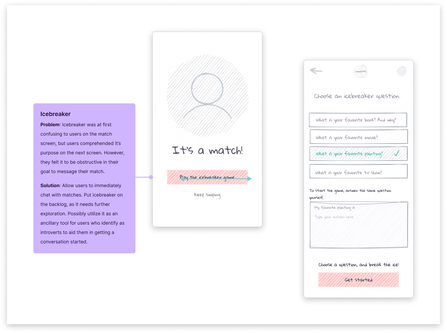
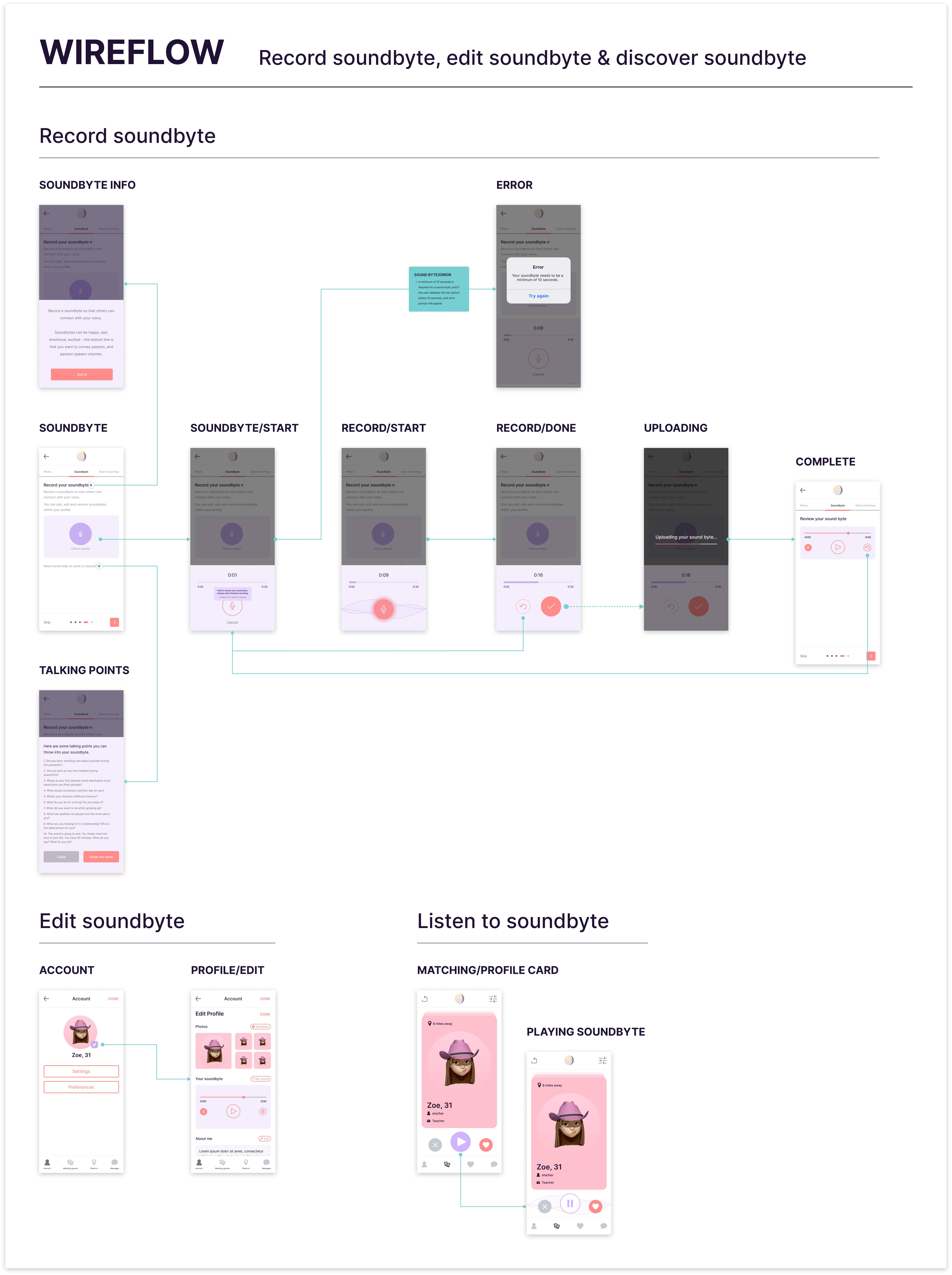
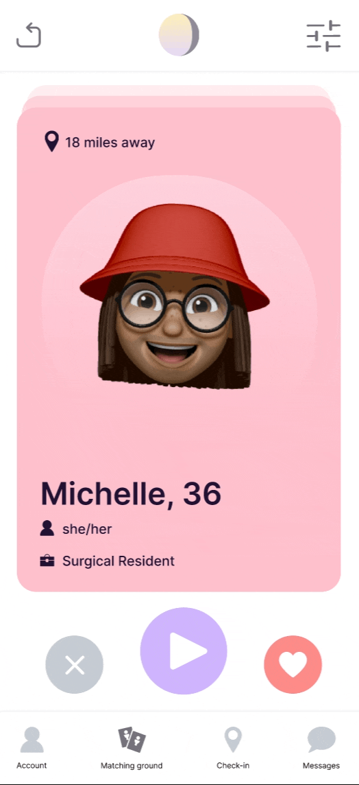
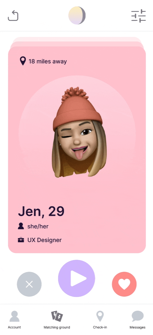
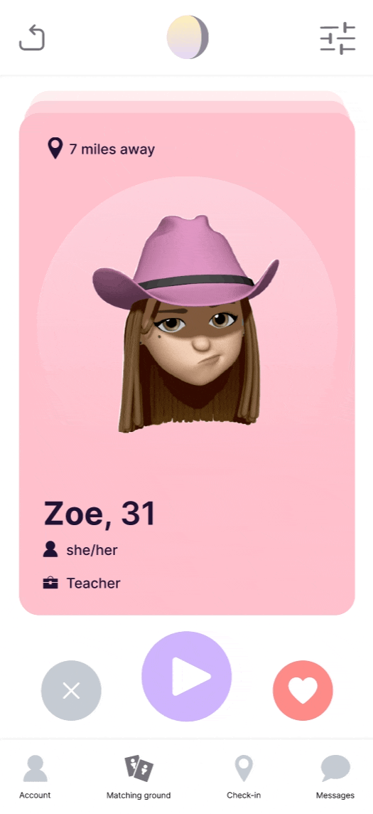
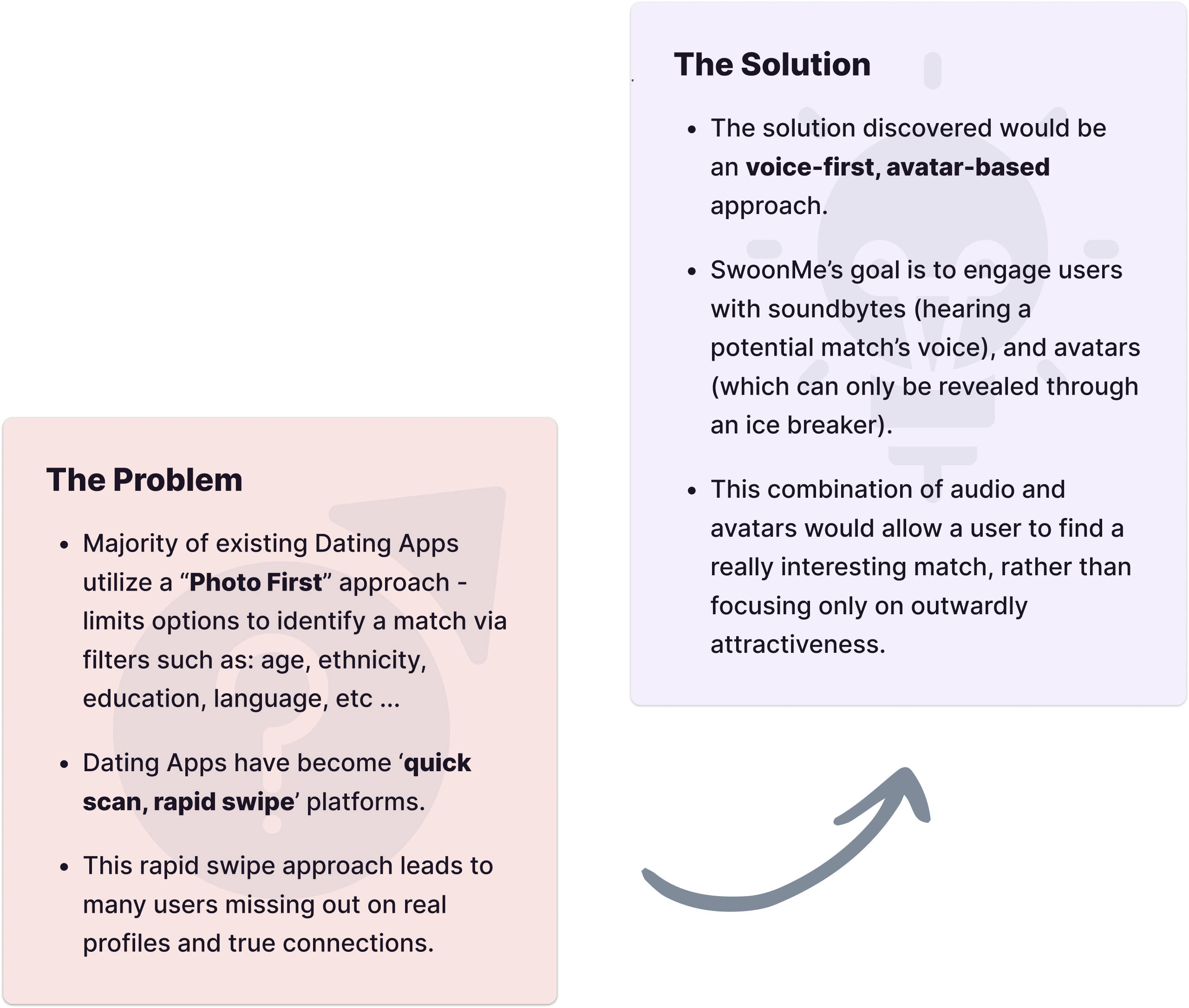
SwoonMe is a voice-first, avatar-based dating app designed to eliminate superficial dating through voice interactions and ice breakers for avatar reveal.


SwoonMe’s incentive is to build a dating experience for singles seeking something long-term - by allowing users to get to know each other with real human voices rather than randomly swiping through profile photos.

Team & role

Role

Lead Product Designer

Team

Tanvi (Founder/PM), Bryce (Engineer), Allie (Marketing Specialist) & Myself (Design and UX QA)

Tools & Methods

Figma, Asana, Research, Wireframing, Wireflows, Prototyping, Usability testing, User interviews, QA testing

Duration

6 mo.

Recognizing the problem

Most dating platforms utilize a “Photo first” approach, which implies that users searching for potential matches probably rely solely on superficial properties.

The problem was that users would primarily make decisions based on how someone looked in their photos, rather than gathering details about the person behind the photo.

We articulated the problem statement as: "How can a mobile dating app be improved, so that there is an increase in the number of people who are able to make “real” connections that lead to long-term relationships?"

Discovering a solution

The proposed solution was to use audio and avatars to encourage users to connect with someone based on who they are beneath the surface, aiming to connect on a multitude of levels rather than physical attractiveness alone.

We also wanted to bridge the gap in terms of when matches are made and conversations are started through the solution of an icebreaker.

This feature would provide the user with a set of questions that were tailored to their match to get the conversation started on a more meaningful and worthwhile level.

Conducting user research

We were able to recruit participants for research utilizing social media and our own inner circles.

We reached out to:

- 16 single people (all using dating apps) & 5 people who used dating apps and eventually met their significant other.

Key findings
  • Lack of matches - only a small percentage of men get matches in significant numbers.
  • Limited responses - girls frequently do not message back after male users send the first message.
  • Slow dating process - although “matching” can be quick, actually meeting and going on a date can be a slow process with significant time between matching, initial conversation and an actual date.

Creating user personas

Through user research, we determined two different personas that can represent our main users.

For Natalie, quality is much more important than quantity. She desires a dating app that allows her to find a date who doesn’t hide behind misleading information, and is capable of asking to meet rather than continue a long conversation.

Darius was in a long-term relationship in the past, and since then he has been dating frequently, with no serious intentions at that time. His focus now is to find someone for a long-term relationship. For Darius, speed and quality are two things he desires in dating apps.

Evaluating domain research

Domain research was conducted on several popular dating apps. The goal was to learn why people used these dating apps, learn about pain points and identify gaps.

Evaluating domain research

Domain research was conducted on several popular dating apps. The goal was to learn why people used these dating apps, learn about pain points and identify gaps.

Performing a heuristic evaluation

As research was collected, a heuristic evaluation was conducted on Bumble to understand usability and spot design deficiencies.

The rules

Before the evaluation, some ground rules were defined and a marking scheme developed.

Marking scheme:

  • +1 (heuristic score plus one) : obeys Jakob’s usability heuristic.
  • -1 (heuristic score minus one) : disobeys Jakob’s usability heuristic.

Scoring:

  • The initial score was set at 51 (on a scale of 1-100). * The heuristic score fluctuates according to marks rewarded.

Performing a heuristic evaluation

The process

The heuristic evaluation was broken into three phases. At the end, a cumulative score would be calculated. The purpose of these separate phases is to initially focus on user-heavy features - features that users most frequently use or encounter.

Phase I focused on onboarding and the matching ground. Phase II would delve more into post-matching, focusing on messages and chats. The final Phase would look at more account related features, such as: profile, preferences, etc …

Performing a heuristic evaluation

The results

The evaluation started at a score of 51, but after all three phases of evaluation, the level increased to 61%.

This showcased that Bumble is a well designed app with a quality heuristic score. This score could be considered a baseline, and if bumble were to engage in further design initiatives, these efforts should align with the goal of increasing this score in future evaluations.

Defining the MVP

At this stage, research had provided a lot of valuable insights and we shifted our focus to defining our MVP.

We decided on the features we believed would be valuable to users, and remained steadfast on our vision of a voice-first, avatar-based dating app solution.

Through audio snippets (soundbytes), the voice of a potential match could be heard and allow for a more meaningful connection rather than simply basing decisions on photos. Utilizing avatars - before revealing real photos - was a strategy to ensure people did not get stuck on physical attributes. Finally, icebreakers would ensure a conversation is actually started.

  • Must have: Onboarding, Soundbytes, Profile, Settings, Preferences, Profile cards, Matching, List of matches/conversations, and chat.
  • Nice to have: Check-in, Icebreakers - Initially tried to get these on the roadmap for MVP, but due to the complex nature of both features (learned from insights provided during testing sessions), a collective decision was made to revisit, iterate and test these features further during post-MVP.

Mapping the experience

Once we had collated our research and started work on lo-fi wireframing, an experience map was created to help visualize the entire end-to-end journey of the user. It gave us a solid idea on gaps in the experience, opportunities available and exigent pain points.

Mapping the experience

Once we had collated our research and started work on lo-fi wireframing, an experience map was created to help visualize the entire end-to-end journey of the user. It gave us a solid idea on gaps in the experience, opportunities available and exigent pain points.

Prototyping & testing

Lo-fi testing

Testing was done considering that the user had already completed onboarding.

Icebreaker

Pain point: Users were confused when matching. They assumed that they could immediately start chatting with their match. When seeing the icebreaker call-to-action, they were curious, but felt as though it was an unneeded step as they preferred to simply enter the chat and send a message to their match.

Solution: Icebreaker was a feature that needed more fine-tuning, so we decided to put it on hold, and revisit it post-MVP.

Lo-fi testing

Check-in

Pain point: Some users were curious about the difference between check-in and discovery (card deck), as they found them similar.

Solution: The check-in feature does differ from the card deck discovery feature. The difference is that when swiping cards, that user may or may not be online, but will always appear in discovery. As for check-in, users will see all other users who are online and nearby in terms of distance. Here, we decided that since card swiping is a familiar pattern, no solution was required there. However, for check-in, we realized that a short, concise prompt educating the user could be useful in helping them grasp how it works. This prompt would only appear the first time the user enters the check-in screen.

Mid-fi testing

In order to ensure a seamless experience for users, we conducted contextual inquiries, explaining a scenario for the test using a semi-structured interview method.

Interviewees

Interviewed 8 people using the guerrilla testing technique.

Mid-fi testing

In order to ensure a seamless experience for users, we conducted contextual inquiries, explaining a scenario for the test using a semi-structured interview method.

Interviewees

Interviewed 8 people using the guerrilla testing technique.

Mid-fi testing

Tasks
  1. Start using the app, browse and send a message to someone when you’ve matched.
  2. Check-in to see if anybody is nearby.
  3. Apply filters when searching for a match.
  4. Reveal your photo to that match.
  5. Re-record your sound byte.
  6. Update your profile.
  7. Change your matching preferences.

Wireflows

Wireflows

Wireflows are a hybrid design artifact that combine wireframes with user flows and can also offer annotations. They are a visual representation of screens and interactions.

For this project, wireflows were created to visually communicate the UI and flow in an effective way - resulting in less design artifacts requiring sets of eyes from the team.

They played a vital role in communicating functionality to the team, and helped to generate thoughts, insights and feedback - leading to new design ideas and potential solutions.

Hi-fi prototyping

A high-fidelity prototype was created for testing to allow both visual design and interactive behaviour to be experienced. The prototype was created entirely in Figma.

The advantages of the hi-fi prototype were that the combination of interactions and design allowed for a more realistic testing framework, and participants were more highly engaged during testing sessions.

By far the most useful advantage from a design perspective was that the hi-fi prototype facilitated rapid iteration and fail-fast/learn-fast experimentation.

Hi-fi testing

Our hi-fi prototype combined transitions and interactions to not only see the UI, but interact with it to see where it takes you. It provided a more realistic testing framework, and participants were more highly engaged during testing sessions.

Hi-fi testing

Our hi-fi prototype combined transitions and interactions to not only see the UI, but interact with it to see where it takes you. It provided a more realistic testing framework, and participants were more highly engaged during testing sessions.

Hi-fi advantages

By far the most useful advantage from a design perspective was that the hi-fi prototype allowed for more concise testing, facilitated rapid iteration and afforded fail-fast/learn-fast experimentation.

Hi-fi advantages

By far the most useful advantage from a design perspective was that the hi-fi prototype allowed for more concise testing, facilitated rapid iteration and afforded fail-fast/learn-fast experimentation.

Takeaways

  • A new vertical. Working in the domain of online dating was an interesting turn for me, coming from networks and healthcare - but, was able to do the research, learn quickly, and become an expert in the domain, which helped develop solutions that aligned with user needs.
  • Growth. Given full autonomy to embrace design thinking, I was able to use my skill set to talk to users, empathize with them, look at the problem in different ways, conceptualize solutions, design and test. Collaboration with a cross-functional team was crucial in taking an idea to fruition, and communication and healthy tension helped us forge strong partnerships.
  • Next steps ... I would not be there for launch, but before my departure, I was able to add the icebreaker feature to the engineering roadmap for post-MVP - having wireframed, prototyped and tested this feature, it incorporated gamification, and would be an interesting offering that would hopefully increase retention and session times.